Website Footer Design: Do’s and Don’ts
The footer is one of the most overlooked yet important design elements of any website. Located at the very bottom of each page, the footer serves key functions like providing quick access to important links, legal information, social media connections, and more. When designed well, footers enhance user experience and SEO. When neglected, they create confusion and frustration.
To help you make the most of this prime website real estate, follow these do’s and don’ts of strategic footer design:
Do’s:
Include Links to Top Pages
Use the footer to link to your most important website pages like the home page, about page, services/products, contact information, and any other high-priority content. This allows quick navigation and reduces clicks for users.
Feature a Sitemap
A sitemap in the footer is extremely helpful for both users and search engines to easily locate all the key pages of your website from any URL. This improves crawlability and information architecture.
Incorporate a Search Bar
Particularly for larger, content-heavy sites, adding a search bar to the footer allows visitors to quickly search for topics and pages of interest from anywhere on the site.
Share Contact Information
The footer is a smart place to list your business name, physical address, phone number, email address, and links to your prominent social media profiles. This info should be prominently accessible to visitors and search engines.
Add Calls-to-Action
Whether subscribing to an email list, booking an appointment, or downloading an ebook, the footer is a great spot to feature simple calls-to-action to drive desired actions from users.

Don’ts:
Link to Too Many Pages
While linking to top pages in the footer is ideal, be selective and avoid having an exhaustive list of every single page link. That creates visual clutter and isn’t very usable. Stick to your most important links.
Use Complicated Layouts
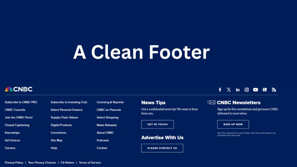
Footer layouts should be clean, simple, and easy to scan quickly. Avoid footers with complex designs, tiny text, extreme lengths, or too many visual elements and colors. Prioritize usability and scannability.
Make Content Hard to Find
Key footer content like contact info, legal policies, and social links should be neatly organized and simple to locate at a glance. Don’t scatter this info across a chaotic or confusingly designed footer.
Bury Legal Information
Your footer is the proper place to link to legal website policies like Terms of Service, Privacy Policy, Copyright notices, and disclaimers. Don’t make visitors hunt for this critical compliance information.
Neglect Usability Testing
As with any UX design, test your footer with real users to pinpoint issues with information architecture, scannability, and location of key elements. Don’t take shortcuts on usability.
The website footer plays a role that is too important to be an afterthought. When thoughtfully designed according to best practices, footers boost credibility, enhance SEO, drive conversions, and provide a superior user experience. Give your website’s footer the attention it deserves.


